In the physiological and mental way , color should be the best for human and sleep process.
We are touching something very deep:
Color really affects the nervous system and brain waves, especially during sleep.
In a pure physiological and mental way, according to research on sleep science and color psychology:
Blue is the best color for sleep. Why? Blue tones lower blood pressure, heart rate, and body temperature — all the things your body needs to naturally slow down before deep sleep. It also helps regulate melatonin (your sleep hormone) through its calming effect. Second-best: Soft neutrals like pale gray, beige, or light pastel greens. Why? They are gentle, non-stimulating colors. They create a safe, grounded environment, letting your brain “switch off” and transition into deeper sleep stages.
Important:
Bright colors like red, orange, bright yellow, and strong purples stimulate the brain and can actually delay sleep onset or create restless sleep. Even though some people find dark colors cozy (like navy or dark gray), too-dark can sometimes feel heavy or depressing if the room has no natural light.
Summary for ideal bedsheet color for human sleep:
Soft, pale blue → Best.
Light gray or soft beige → Very good if you want a neutral tone.
Pastel green → Also very good for calming the mind and emotions.
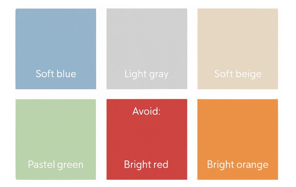
Avoid: Bright reds, oranges, intense yellows, vivid purples.


